FAQ - Printing
1. Dot Gain2. LPI & DPI
3. Sheet Sizes
4. Don't use these file format
5. Picking paper
6. Print job demons
7. Colors?/Sides?
8. Folding
Dot Gain
When ink hits paper, it likes to spread out. Depending on a lot of factors, it may not spread much or it might spread like wildfireBasically dot gain is a side effect of printing. Just like when you put a paper towel on a spill, ink will spread out when it comes in contact with a printing surface. It is a normal and expected event and usually nothing to worry much about.
Different paper and ink will effect how much the dot gains in size. Coated paper tends to have minimal dot gain. Rough paper stock (such as newspaper stock) will absorb more ink and can result in a large amount of dot gain and an ill-behaved dot shape. When there is a lot of dot gain, images look darker than they should and colors can shift. Too great an image density also causes a muddy appearance and any dark shadows to fill with ink.
While designers and print buyers may never even consider dot gain, printers and pressmen are constantly aware of it. High-end publishing software allows designers and prepress professionals to compensate for dot gain. In Adobe Photoshop, you can compensate for dot gain but only power users who know what they are doing (or have been instructed exactly what to do) should modify their settings.
LPI & DPI
Just what do they mean-to you?DPI and LPI are two important acronyms that can mean the difference between looking good in print and disaster. Knowing what they mean and how they affect your print job is important.
DPI (dots per inch) can refer to many things associated with desktop publishing, including the resolution of a computer monitor, scanner or output device such as an imagesetter or laser printer. Photos and other rasterized images are also measured in dpi.
LPI (lines per inch) is also called screen frequency or screen ruling. This number determines the visual quality of the final printed piece and usually refers to the resolution of an output device like an imagesetter or press. The higher the number means more lines per inch in a digital halftone. More lines mean more detail and sharper images.
The most important thing you need to know when it comes to lpi and dpi concerns your images. To make your photos look good in print they need to have enough dots per inch but not so many that the file is massive. Excessive dpi can bog down your workflow, take up a ton of space on your hard drive and slow your page-layout application to a crawl.
Newspapers traditionally print with an 85-line screen. Magazines that use coated paper are output at 133 or 150. The lpi of your print job depends on a few factors, most importantly the kind of paper you are using. Lower quality paper needs larger halftone dots because small dots are more difficult to print properly.
Ask us what lpi you should use. Once you know this number, it will help you determine what dpi your photos should be. For optimum results, the dpi of your images should be 1.5 to 2 times the lpi of your print job.
For example, if we say your print job will be run out at 133 lpi, then your images should have a dpi of 199.5 to 266 (most people just use the higher number). Typical dpi resolutions include 72 and 90 for the Web, 170 dpi for newspapers (2 times 85 lpi) and 266 to 300 for magazine and other offset printing (2 times 133 lpi or 150 lpi).
Sheet Sizes
Thinking about sheet sizes early on can save you a lot of moneyWhen initially planning a print job, one of the absolute first things that should be considered is how big it is going to be. Color, number of pages, bleeds, budget and deadlines are also major considerations, but size can potentially be the most troublesome.
Paper cost can easily be one, if not the largest cost in a print job. To watch paper cost, one of the best ways to control it is to make sure your print job will fit available standard-sized paper sheets. Some standard sheet sizes are 23 x 35 inches, 25 x 38 inches and 35 x 45 inches which are cut to the finished document size after printing.
For example, you are planning a non-bleed print job approximately letter-size. It is far more cost effective to use a page size (like 8 1/2 x 11 inches) where multiple pages of your print job will fit nicely on a standard sheet such as a 23 x 35 inch sheet. Designing a page 12-inches tall might make the difference in fitting one instead of two pages efficiently on a sheet resulting in a lot of wasted paper.
Custom or oversized pages increase costs. When planning your next print job, knowing the size of the press sheet can help you design your materials in the most cost-effective and efficient way possible. Don't forget there needs to be area left for bleeds, color bars, trim marks and the gripper edge (the edge of paper that is grasped by the grippers of a press). Because this can be complicated, feel free to contact us with any questions.
Don't use these file format
GIF and JPEG formats not good for printSaving images for high-resolution printing and for the Web require very different procedures. One thing that is important is to use the correct file formats.
Use only TIFF and EPS file formats when creating images for print pieces. They work for everything from photographs edited in Adobe Photoshop to drawings made in Illustrator or Freehand. Except for some flavors of EPS, do not use other file formats for final output.
Two popular file formats for the Web have been known to creep into print production workflow and should be avoided.
• GIF (Graphics Interchange Format) was developed by the online service provider CompuServe. Good for Web graphics, GIF format compresses the color palette down to 256 colors or less. This makes the file smaller and decreases download time. GIF images are also suspect for having a low resolution of 72 dpi. This is acceptable for a monitor, but rarely for the printed page.
• JPEG (Joint Photographic Experts Group) is good for compressing and archiving photos and is the dominant file format for photo-realistic images on the Web. Many photographers or scanner operators will JPEG their images for storage on CD or disk. These images then need to be reopened in an image-editing application (like Photoshop), edited and saved in an acceptable file format for print.
Some other file formats that should not be used for photographs for print jobs include Windows Bitmap (BMP), AMIGA IFF, PlashPix, PCX, PICT, Pixar, PNG, RAW and Targa.Picking paper
Looking around to make your next print job stand out? The paper you pick not only has to look good but it has to be rugged enough to do the jobYour client said they wanted their marketing material to stand out from the competition. They not only want it to look different but also feel different.
While there are many options, choosing the paper stock has to be one if not the most important design decision. There is paper that is glossy, shiny, pitted, slick, water resistant, thin, thick and even paper made out of reclaimed denim jeans. There are literally thousands of choices. Paper product manufacturers have books full of paper samples for you to consider.
The kind of paper used in a print job can greatly enhance or detract from any design. Imagine getting a diploma invitation on dingy newspaper stock. How would you feel? On the other hand, imagine getting the daily newspaper on glossy paper that cost $10.00 per issue.
Paper can be the largest expense in a print job so it is very important to understand how your paper choice will impact your budget. While poor paper selection can ruin a great design, picking one that is too pricey can needlessly waste money.
Including price, there are many factors that will effect your paper selection. When planning your next print job, ask yourself what you expect the print stock to achieve as far as performance. Is it going to be read once and discarded? Is it going on an outside rack next to dozens of other glossy brochures? Will it get wet, bent, crumpled or used a lot? When considering what paper to use, know the performance characteristics that will be needed.
With thousands of choices, it can be a little overwhelming. Instead, give us a call and we can recommend paper manufacturers and make suggestions on stock. Because we deal with paper all the time, we are familiar with what is out there and can guide you with your decision. Not all paper is created the same and our experience can save you problems.
A paper that looks good in the sample book may be unavailable or might not be rugged enough for what you have in mind. Funky paper that incorporates grass clippings, hops and barley or seaweed may have interesting oddities, but they won't be so interesting to your client when it refuses to fold flat when bound.
Print job demons
Your design looks great. You are happy. Your client is happy. So why does it refuse to print correctly!?!Even the most experienced and computer-savvy desktop designers have been tortured by seemingly possessed files. Most problems with electronic files are either font or image related. Master the basics of these two areas and most print-job demons can be exorcised.
• Missing fonts — The desktop publishing revolution began more than 15 years ago and the number one problem is still missing fonts. Banish potential font demons back to the pit-of-doom by purchasing and religiously using a font collection utility.
• Missing images — One missing 40 MB image can really ruin your day and print job. Instead of just getting a font collection utility, consider getting a preflight utility program that collects images in addition to fonts while checking your files for other problems. Utilities such as FlightCheck from Markzware (www.markzware.com) or Preflight Pro from Extensis (www.extensis.com) are good choices.
• RGB images in a CMYK print job — RGB (red, green, blue) is the color mode used when viewing color images on a monitor. But most presses use four inks to make color images: cyan, magenta, yellow and black (CMYK). Unless you have a modified workflow, make sure all your photos are in CMYK color mode. Otherwise they may come out with no color at all.
• The dreaded extra plate — So your four-color job has five separations? Oops. You are suffering a possession from the dreaded extra-plate demon. Go back and make sure all the colors in your page-layout application are process and not spot. The best way to make sure this demon is not still haunting your print job is to eyeball your page-layout print options with separations turned on or printing the file with separations on. If you get five sheets of paper for each page, you are still possessed.
• WYSIWYG is not true for color — The red on your monitor will probably not look the same as the red on the printed page. Despite having a calibrated monitor and standard viewing conditions, colors on screen will be different from on the printed page. If your monitor is in a bright area or not calibrated, the color difference will be even greater. Make important color decisions from a printed proof.
• Low-resolution images — Does the image on your monitor look fine but jaggie and blurred in your proofs? You are probably using a low-resolution image. Your monitor is most likely set at 72 dpi. Your laser printer has a 300 to 600 dpi resolution. Printing presses are even higher. Your images need to have a dpi 1.5 to two times the linescreen of our output device. But be warned-you can't increase the resolution of an image in Photoshop just by typing in a higher number. Most of the time they have to be rescanned.
• Banding in blends — Although blends, vignettes, fountains and gradients can really make a design look great, using them improperly can make your hard work look horrible. Banding in blends looks like stair-steps where there should be a smooth gradient. These demons are hard to explain and can be even harder to banish. And they may even show up on proofs but not in the final print job. Keep these demons at bay by not making blends very large, creating them in Photoshop and using a wide range of tones.
• Corrupted fonts — Fonts can become corrupted. They can cause your print job to fail, your computer to crash and your applications to quit. These can be the most evil demons to possess a print job. If you suspect a corrupted font may be at the root of your problems, reinstall a fresh copy of the font.
• Images in wrong file format — You should use the TIFF or EPS file formats for saving your images for printing. Do not use JPEG, GIF, BMP or the dozens of other options Photoshop offers you. You may have to use the DCS 2.0 flavor of EPS for some special jobs but that is an exception. JPEG is good for archiving images and publishing them on the Web but not for printing.
• Dirty page-layout files — Don't leave unused images and scraps of text just laying about. You are just asking for trouble. Images on the pasteboard in your page-layout program may not directly add to your printing problems, but they do increase the size of your print job and may be confusing for our prepress department. Get in the good habit of cleaning up your files.
Colors?/Sides?
When we ask for a quotation or place an order, we have to clearly describe how may colors are there or how may sides to print.For example one piece of paper with one side black color printed, other side is empty, we use Black/0C.
Black/Black = Two sided printing, both Black ink.
1C/0C = One sided printing, That one color can be any PMS color,
2C/Black = Two sided printing, one side is two PMS color (one may be Black) and the other side Black color
4C/4C = Both side are 4 color printing. Normally it is a full color printing base on CMYK colors
When talking about PMS color, you have to make clear if it is any special PMS color like: gold, silver, metallic.... Also, If there is duetone, tritone... effects, large are 100% colors, it may affect the print cost and time.
Folding
How to describe folding a piece of paper....A piece of paper without folding – Flat sheets
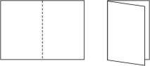 Single Fold
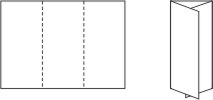 Tri-Fold
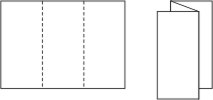 Z-Fold
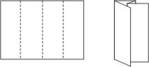 Double Parallel